Showing posts with label Victoria Skopouscenko. Show all posts

Thursday, 23 January 2014

it has come to and end...

Okay so, this is the final post, the last ever post of the year for Alevel Media (which makes it much more meaningful) 

This has, no doubt been a great experience, which wouldn't have been any good without the struggles,  the appalling weather when travelling around London with all the equipment.. we still managed to have a great time whilst doing this and getting to know each other! 

Ali Jarjis, the artist! You showed no hesitation and worked great with a 3/4 girls in the group. The girls, Jordane Davis and Elizabeth Anibaba, I genuinely enjoyed working with you and won't forget the great laughs we've had during the rough and stressful times (along with the bright ones of course) and how laid back and easy to get along with you all were from the beginning.


This concludes.. and it has been a pleasure.. hope you enjoyed your stay!


Final Progress Review Blog


Blog posts include research of music videos, which fall into the research and planning. Additionally the influence on digipak for slight details such as the dates, and style such as the 'Example' artist advert below.


The 'Available on iTunes' logo on the bottom right also worked as an influence on my final advert, however, largely it had also been my initial personal idea in the beginning. I was just fortunate enough to find something very similar to my idea, and to the genre as well!


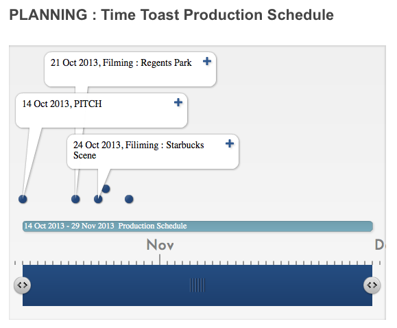
TimeToast also showed not only the planning but also progress from the activities before, i.e the Pitch which was performed already.

The blog posts also include planning for filming the music video, I think successfully enough to show the strict and only plans.


Given another opportunity however, I would organise myself a little bit better in terms of frequent blogging, that is to keep myself clear with the check-list.

Evaluation Question 4


Final HD Music video


Overall we had been very pleased with the feedback that was obtained, and was all positive. Everyone who had seen the video liked the story behind the lyrics, and was amplification according to some feedback. Audience also noticed the necklace in the video, which we were very happy with because it is the synergy for our project and will be used in the digipak.


Feedback received via blogger.com

This feedback was extremely useful to me as I have improved the advert and believe it is much better now after the feedback given. After all the usefulness of any audience feedback is extremely high, simply because that is who I would be selling my artist to, via the same advert commented on and Digipak.


This feedback was taken after the screening and what we received was positive for the most part. The flashbacks and black and white effects were 'cute' which in other words, is a good thing. We achieved what we we're hoping to achieve with the amplification of the song in our music video. 


Our costume was also commented on, as it 'worked very well' along with the match cuts.

What I have also learned from my own feedback and reflection is that hard work pays off and group work in a case such as this project, are really important. Due to good team work and communication within my group we didn't have any disagreements which we didn't work on and experiment with. This includes all the pictures taken, which were all the locations we had in mind to use for filming, but in the end there had been some alterations.


Personally, if I had to critique my own music video, I know that the sync would be worked on for longer hours and filmed with a lot more effort. By this I mean, base-track editing, and every base-track would be filmed from the second the original song starts, until the right end. Therefore it would be much easier to match the sync of the song.


Another thing I would also change if given another chance based upon feedback, is the digipak photograph.


That is because, looking back at it now with all the feedback, I realise that it would be a lot more powerful for a new upcoming artist to look directly at the camera, and catch the audience attention, (not to mention the target audience fans!)

Thursday, 16 January 2014

Evaluation Question 2


(if can't see well click on prezi below)


The video above is a demonstration of the links you can find between the ancillary work and music video.


 The synergy can be seen though out all promotional packages. According to audience and teacher's feedback, it had been 
noticed. Both the yin yang necklace and purple hoodie worn, and both are seen on the Digipak. The purple font obviously linking to the video, the and necklace also being the main prop for the artist.


This is important because the audience may grow to associate the colour and the prop with the artist, so upon buying the CD and see in the music video they should b able to see the links as they watch.


All of the visual links between the ancillary products have been kept consistent, such as the synergy product 'yin yang' necklace and the colour purple, along with black and white (flashbacks) this has been done to make sure the audience create an association with the new artist, and after seeing the video would remember props (necklace), and if not, the colours. The target audience would feel attracted to this after seeing the video and liking it. However, there are some issues with CD's lately, merely because the new age technology, you can always download music off iTunes or use SoundCloud etc. Although that is true, those who do collect CD's of their favourite bands/artists would not pass this up, and the association from the video helps them recognise this artist.

Monday, 13 January 2014

Teacher Feedback


This was the final feedback I've received on the work below

Front Panel Digipak

Inside Panel

Advert

As for the A5 advert, I took on account the feedback I've received and improved the advert based on the comment below, and think it looks better now than before and is not 'a bit plain'.


Evaluation Question 1


Question 1 part ii continued below on Prezi:

Saturday, 11 January 2014

Ancillary Work Published


FRONT COVER
INSIDE 2 PANEL COVER

ALBUM ADVERT #1 - A5
ALBUM ADVERT #2 WITH REVIEWS - Newspaper/Magazine Advert
TOUR DATE POSTER - A5 for Newspaper/Magazines that can take up half a page

Friday, 10 January 2014

Progress on Advert


My progress on the FINAL Tour Dates poster, here I used my own Photoshop CS5 at home.

However, now that the piece if finished with the rest of the ancillary work, looking back at it now, I think that maybe the influence on the forward slash / could've been used as an example/draft Tour Dates advert. That is because using the dot (like in the advert) would be more relevant for me to use to be consistent

Thursday, 9 January 2014

Progress Review

 teacher's feedback

After taking this feedback on board I went back to any unfinished posts to improve them. This I did by re-creating the content on Prezi, brainstorming and adding any GIF's to make my blog more visually interesting. (Which will hopefully pay off!) 

Final Ancillary Presentation


Here is a presentation which I have made to illustrate any final changes I have to the promotional packages, regardless how small, I surely hope the changes are for the better! (Based on teacher's feedback, I don't really doubt it!)

Tour Dates

First Attempt at a Tour Dates Poster for Magazines and Newspapers


The way I have laid out the dates on my advert have been influenced by this advert I have found on Google. Similar is also the artists pose, regardless of whether the genre is the same or not. I used the forward slash '/' because I think it is visually easy on the eyes. 

Monday, 6 January 2014

Audience Feedback


This feedback is very helpful as I can now improve the Advert for the better according to audience requests/liking.


I have also produced a survey on Survey Monkey to get some more feedback for the absolute final pieces, which I will address in my evaluation question.

Friday, 20 December 2013

Research on Tour Date Posters


Here are some posters I have come across that caught my eye. I wanted to find out what kind of information can be used on such specific posters and what I should avoid.            All three posters here very different artists and present their information differently.


'Buy Online' and '24hr Hotline' including the social networks for the artists
The main information such as dates and locations. I will use the forward slash in my own tour dates poster.

Thursday, 19 December 2013

Inside Panel Improvements

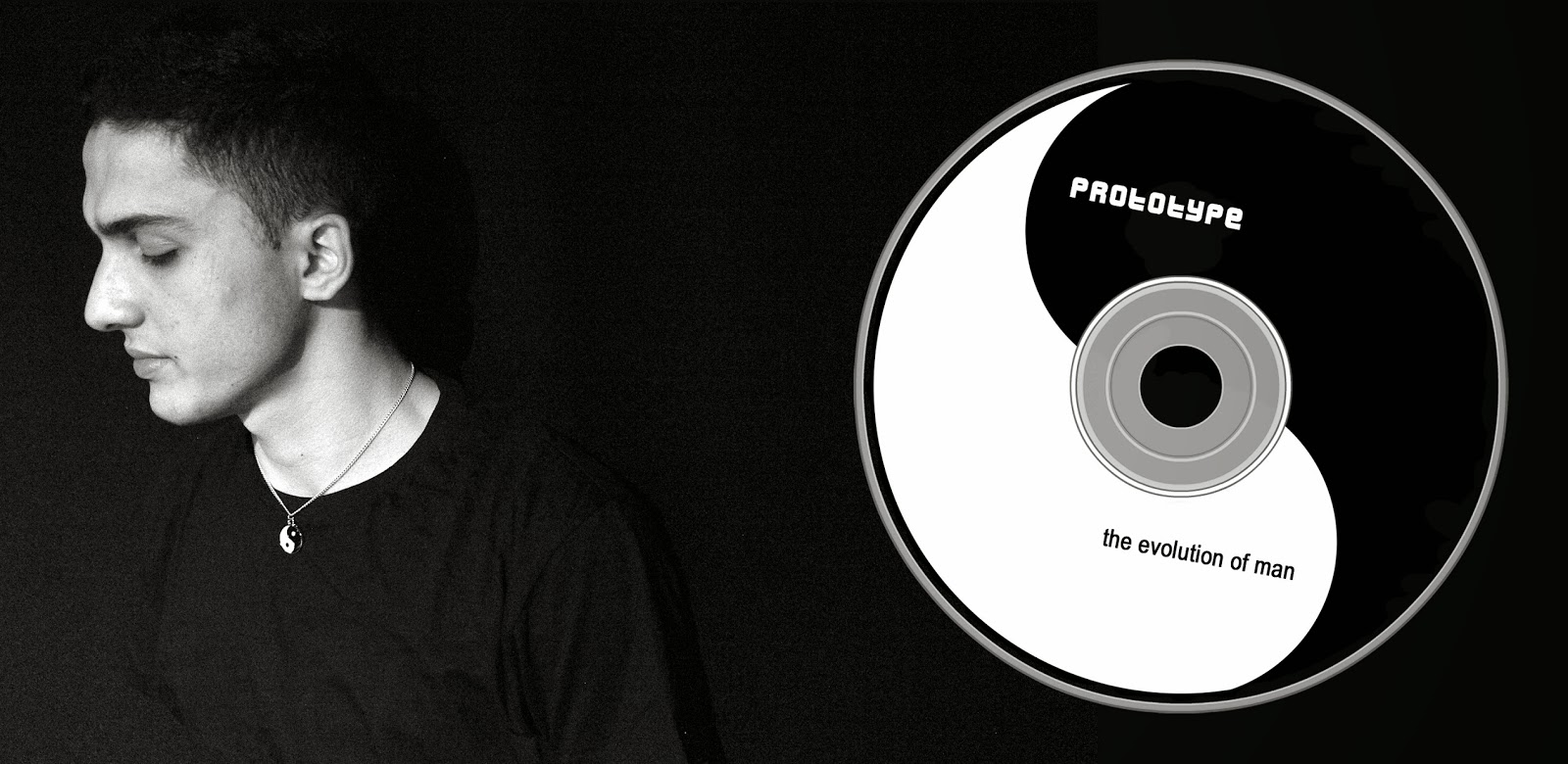
I have used a different photograph which blends in well with the black background, and added the name of the artist and album to the CD itself so it is not as bland and boring, still leaving it very simple.

Advert #2


This is a second advert I have created that can be used in magazines, and have more variety for the upcoming artist.


Inside Panel, Progress

First attempt at the inside panel of the CD cover

Second attempt for the final inside panel, an improvement from the first one due to the right size of the picture. Also added the name of the artist and album name to make it look less dull.

Sunday, 15 December 2013

Feedback on Ancillary Work

The feedback that I received on this advert had been positive and negative. Positive is the minimalistic layout and colour used. It is simple and easy on the eye. However, the negative elements of this work, it is 'too simple' and could 'have a bit more colour to make it more appealing to the audience'

Feedback I received on the inner panel was one I anticipated. The CD itself was too plain and boring, and the photograph is seen to end half way through, taking up a 1/4 of the page.