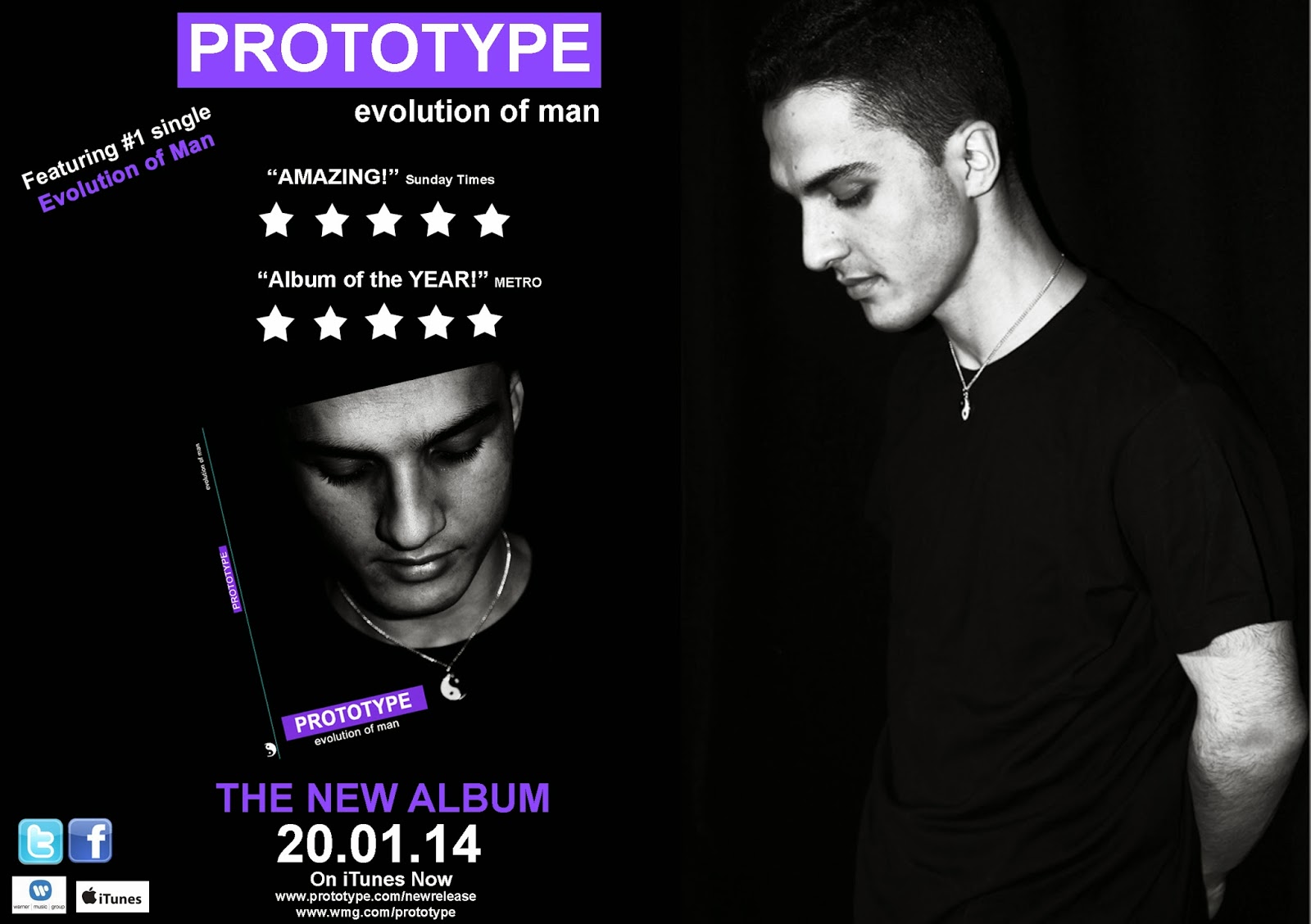
FrontCover: Inspiration:


A reflective photograph, this shows the artist and sets the tone for the album, as in the album
he reminisces on how his past has helped him
evolve into a man
Adele's trademark as an artist is that she deals with a lot of heartbreak. There's
that storied guy who broke her heart, lingering somewhere in the back of
her mind and at the forefront of her songs. But Adele-at least in her
songs and on her album cover— seems to get over her despair by pensive,
rational thought. The photo is technically perfectly executed in a classic album cover fashion—there is no crowding, the lighting is perfect and it looks timeless
FontStyle:
Because 'Prototype' is an
Electro Pop artist, I chose a
font style that represents the
kind of computer made sound Inspiration:
style used in the album music.

I have then used a simple font
for the secondary font, to
counteract the main font (which s the prototype signature font)
David Guetta is one of the artists who are in the same genre group as 'prototype' so I used his tech style font as a reference for the font I will use to identify prototype with.
However, I didn't like that both his secondary and primary fonts were stand out fonts, it looks too much. So I used this as an example and made my secondary font plain.
Colour Scheme
For the ancillary work we chose to go with three colours: White, Purple and Black. Non offensive colours that compliment each other and go with the electro-dancepop sound we are trying to put across.
Inspiration:
To make sure the video and the ancillary are clearly linked I looked back at the music video to see which conventions I could incorporate into my ancillary. We made a big deal about the costume and the Ying/Yang contrast so I picked back and white to go with the ting/yang and purple because thats a significant feature for the video.