Monday, 30 December 2013
Friday, 27 December 2013
Friday, 20 December 2013
Research on Tour Date Posters

Here are some posters I have come across that caught my eye. I wanted to find out what kind of information can be used on such specific posters and what I should avoid. All three posters here very different artists and present their information differently.
![]() |
| 'Buy Online' and '24hr Hotline' including the social networks for the artists |
![]() |
| The main information such as dates and locations. I will use the forward slash in my own tour dates poster. |
Thursday, 19 December 2013
Inside Panel Improvements
Advert #2
This is a second advert I have created that can be used in magazines, and have more variety for the upcoming artist.
Inside Panel, Progress
Wednesday, 18 December 2013
[ANCILLARY PRODUCTION] Process of Inside Digipak
This is a video that shows how the inside of the digipak was made, however the video doesn't show the entire process as I have tweaked it since then which you can now see the final version in my completed inside digipak post. Anyhoo, here is the video, enjoy:
Tuesday, 17 December 2013
[ANCILLARY PRODUCTION] Process of Outside Digipak
Ever wondered what it would look like to make the outside of a digipak for an A2 media course in a slideshow format? Really? Wow, you have really specific tastes. Well, we've I've provided it down below, have fun.
[ANCILLARY PRODUCTION] Audience Feedback
While making my digipak I was unsure as whether I'd leave the back to be completely black or leave it with a small white gap. After asking my target audience to vote over which is better, they'd had decided that the not completely black is better. Take a look at the difference between the two below:
| Completely Black |
![]() |
| Not Completely Black |
Monday, 16 December 2013
Production- Advertisement in Production
These couple of images are just showing my progress on Photoshop of making my advertisement. I've used a few editing techniques for the photo, I've desaturated it to make it black and white, as this is the effect I want running through all my ancillary products. The second photo shows me looking though the shapes, this was for the stars which I'm going to use for the reviews.
Sunday, 15 December 2013
[ANCILLARY PLANNING] Locations
[ANCILLARY PLANNING] Costumes
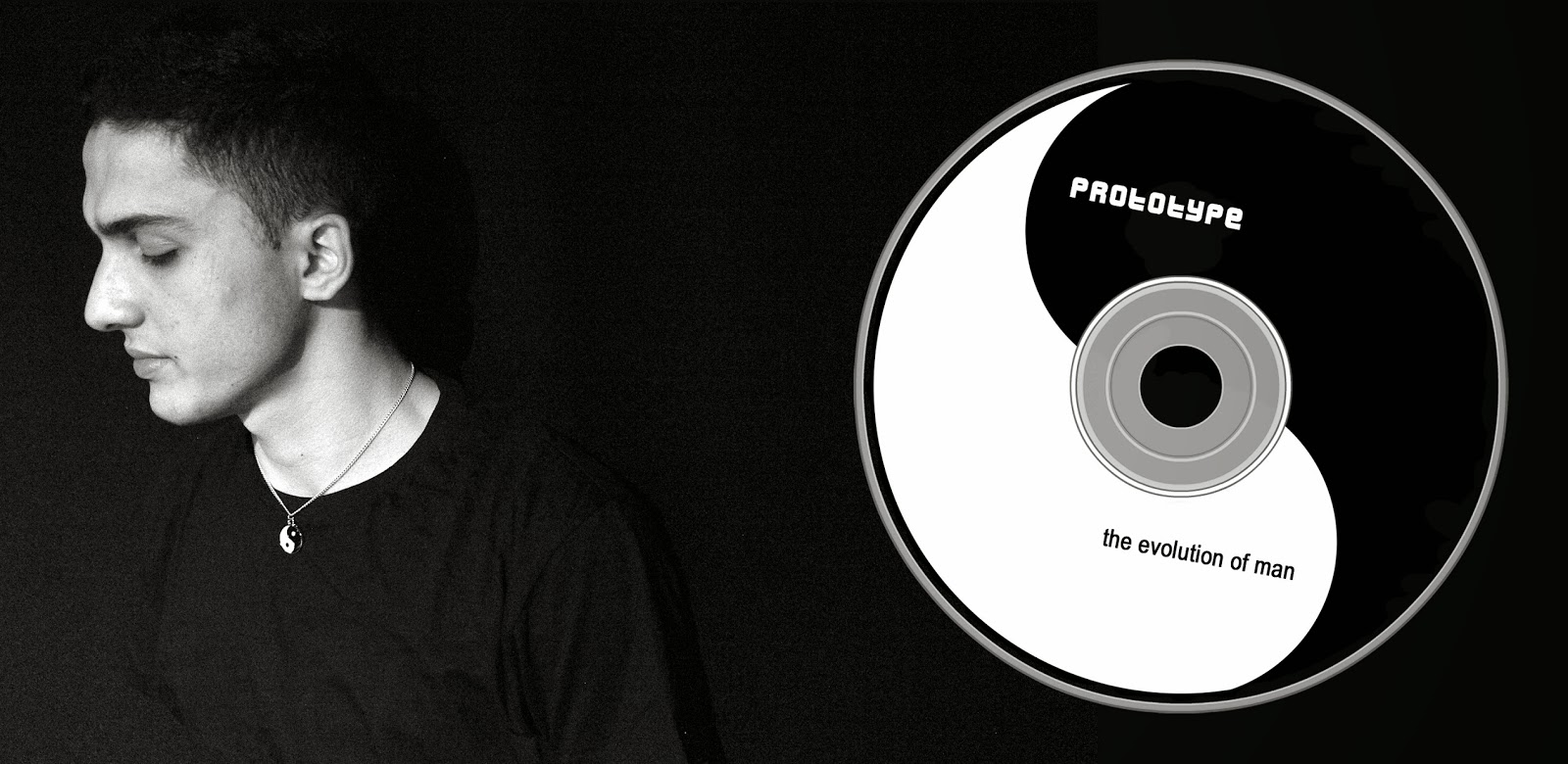
Costume wise we knew we had to have to have the same clothing from the music video to create synergy between the two products. Also the colours of the costume consists of purple, black and white which are the three colours we will limit ourselves to for ancillary products. Below is a side by side comparison of the costume in the music video and an image we took to use in our ancillary work:
Feedback on Ancillary Work
![]() |
| Feedback I received on the inner panel was one I anticipated. The CD itself was too plain and boring, and the photograph is seen to end half way through, taking up a 1/4 of the page. |
Saturday, 14 December 2013
[ANCILLARY PLANNING] Photo's I'm Gonna Use
| Digipak Image |
I will be using these two images for my ancillary products. I chose the digipak one as it is a well shot image of the artist and shows the ying-yang necklace. However I may alter the image to monochrome so as to match the black and white theme present in the music video.
![]() |
| Magazine Advertisement Image |
The second image which I will use for my magazine advertisement was chosen because it is very similar to the Plan B advertisement which I mentioned would be my inspiration in a previous post. I also plan to alter the image to black and white similar to Plan B's image.
[ANCILLARY PLANNING] The Do's and Don'ts
Just like Camel Wrestling, creating a digipak/magazine advertisement has a lot of do's and don'ts but unlike Camel Wrestling I'm pretty sure no one has decided to blog about them, well at least not in such a unique and interesting bullet point formatted style. So strap on your seat-belts, folks, as we go through the universally, socially accepted rules of making a digipak/magazine advertisement.
Do:
- Limit yourself to three colours! Make sure they complement each other and that they are visually appealing (so don't bother trying to use feldgrau, Hitler).
- Just like the colours, limit yourself to two fonts! Make sure their not random, they must relate to the artist or their genre somehow, and for the love of god make sure it's readable. Also don't use comic sans because the internet hates it and it's just best to conform to popular opinions, okay?
- Use a good quality image! Unless your product consists of an image of Sandra Bernhard face there is no reason for it to be pixelated to the point of no recognition. Follow the rule of thirds and make sure the image has some sort of connection to the music video, and you're good to go.
- Give us information! Insert the artist and album name somewhere on there. And Barcodes, copyright information, titles, record company logos, websites won't go amiss, so slap them somewhere on the back.
![]() |
| Nobody asked for this! |
Don't:
- Under no circumstances should you insert any type of "effect". I don't care if someone's got a gun to your head and they claim to be serious, no one like's to see that crappy neon glow on anything. It looks unprofessional and will always ruin a good image.
- Don't stretch the image! This is self explanatory and is even taught to children at birth in some European countries. So just don't!
- Don't place text in front of the artist's face! It'll ruin perfectly good text.
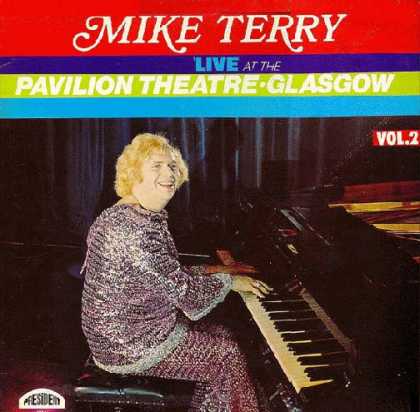
So by the end of this little ride through the exciting do's and don'ts of making a digipak/magazine advertisement your product should no longer look like this:
| I don't care how much of a Mike Terry fan you are! |
But more like this:
| Wooooooooooh! |
[ANCILLARY PLANNING] Advertisment Inspirations
I looked at various music advertisements for inspiration but one that really caught my eye was Plan B's The Defamation of Strickland Banks. The aspect that attracts me to this advert is the colour scheme as it uses a monochrome palette so as to make the red stand out which I plan to the same with the colour purple instead.
Also the sizing of the images and text is really appealing to me as Plan B takes up about as the text all together, this is done to signify his importance. Also the font is consistent throughout adding to the professional look of this magazine advertisement.
Subscribe to:
Posts (Atom)