Friday, 24 January 2014

FINAL BLOG

 ACTUALLY CANNOT *expletive* BELIEVE I MADE IT OUT IN ONE PIECE!
IM GONNA TYPE IN ALL CAPS TO SHOW MY ENTHUSIASM
THANKS DAN & LOUISA FOR BEING GREAT TEACHERS AND ALWAYS BEING THERE WITH A HELPING HAND
I AM SO *expletive * PROUD OF THE GROUP!
THANKS TO ALI  (or should I say, "Prototype")THE STAR OF THIS WHOLE PROJECT, IT WAS ROUGH FILMING IN THE COLD WEATHER BUT IT WAS WORTH IT!
VICTORIA MY BUDDY FROM AS (WE STILL NEED TO CELEBRATE IN WETHERSPOONS, REMEMBER !! LOL) THANKS FOR BEING THE ORGANISER OF THE GROUP AND HELPING ME WITH THE EDITING WHEN I WAS GOING CRAZY (WELL ACTUALLY THANKS TO ALL OF YOU FOR THAT)
JOURDANE THANKS FOR YOUR HELP DURING THE EDITING PROCESS AND BEING THERE WHEN I NEEDED A SECOND OPINION AND FOR YOUR HELP DURING THE FILMING ALSO.
I COULDN'T HAVE ASKED FOR A BETTER GROUP OF PEOPLE I CAN NOW, AFTER ALL THIS IS DONE, CALL MY FRIENDS
NOW THIS IS OVER I CAN HONESTLY ADMIT I NEVER WANT TO SEE BLOGGER AGAIN

WE'VE MADE IT OVER THIS FIRST HURDLE BUT WE STILL NEED TO REACH THE FINISH LINE(EXAM) DONT GET COMPLACENT !  

Final Blog Post

Pull the plug, guys! Larry, try get some gasoline over here. We're gonna burn this place to the grou... Oh, you're still here...? This is awkward; we're finished, this blog is all but done. Well, I guess it wouldn't hurt to say some goodbyes...erm...where do I start...

I'd like to thank my group first of all. Elizabeth, you were a great editor and even when it got stressful at times it was great seeing you find the strength to push through it and not let it get to you. Jordane, you took some great photos, like seriously good, and I hope your pursuit in photography pays off. Victoria, I'm just gonna attribute you with the title of "group leader" with an astonishing 91 93 posts (Jesus Christ!) and you really went out of your way for the group, all of you did in fact. So thanks, guys, and thanks to everyone who gave us feedback, to the teachers and technicians who were with us throughout and to who ever is marking this and gave me an A.

So, goodbye everyone, we hoped you enjoyed this blog and now I've gotta go before people find out just how cheesy this post was...

[EVALUATION] Question 4

Thursday, 23 January 2014

[EVALUATION] Question 3


TimeToast Link

it has come to and end...

Okay so, this is the final post, the last ever post of the year for Alevel Media (which makes it much more meaningful) 

This has, no doubt been a great experience, which wouldn't have been any good without the struggles,  the appalling weather when travelling around London with all the equipment.. we still managed to have a great time whilst doing this and getting to know each other! 

Ali Jarjis, the artist! You showed no hesitation and worked great with a 3/4 girls in the group. The girls, Jordane Davis and Elizabeth Anibaba, I genuinely enjoyed working with you and won't forget the great laughs we've had during the rough and stressful times (along with the bright ones of course) and how laid back and easy to get along with you all were from the beginning.


This concludes.. and it has been a pleasure.. hope you enjoyed your stay!


Final Progress Review Blog


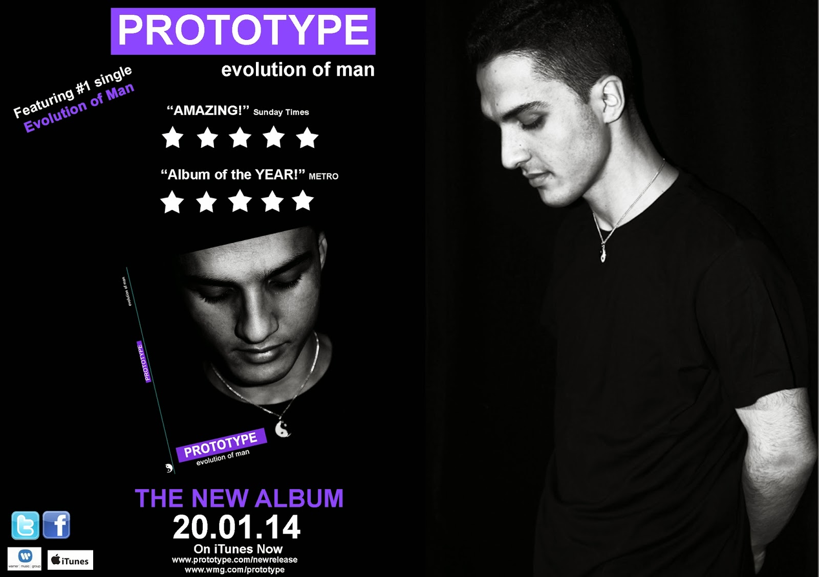
Blog posts include research of music videos, which fall into the research and planning. Additionally the influence on digipak for slight details such as the dates, and style such as the 'Example' artist advert below.


The 'Available on iTunes' logo on the bottom right also worked as an influence on my final advert, however, largely it had also been my initial personal idea in the beginning. I was just fortunate enough to find something very similar to my idea, and to the genre as well!


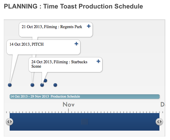
TimeToast also showed not only the planning but also progress from the activities before, i.e the Pitch which was performed already.

The blog posts also include planning for filming the music video, I think successfully enough to show the strict and only plans.


Given another opportunity however, I would organise myself a little bit better in terms of frequent blogging, that is to keep myself clear with the check-list.

Evaluation: question 4


Evaluation Question 4


Final HD Music video


Overall we had been very pleased with the feedback that was obtained, and was all positive. Everyone who had seen the video liked the story behind the lyrics, and was amplification according to some feedback. Audience also noticed the necklace in the video, which we were very happy with because it is the synergy for our project and will be used in the digipak.


Feedback received via blogger.com

This feedback was extremely useful to me as I have improved the advert and believe it is much better now after the feedback given. After all the usefulness of any audience feedback is extremely high, simply because that is who I would be selling my artist to, via the same advert commented on and Digipak.


This feedback was taken after the screening and what we received was positive for the most part. The flashbacks and black and white effects were 'cute' which in other words, is a good thing. We achieved what we we're hoping to achieve with the amplification of the song in our music video. 


Our costume was also commented on, as it 'worked very well' along with the match cuts.

What I have also learned from my own feedback and reflection is that hard work pays off and group work in a case such as this project, are really important. Due to good team work and communication within my group we didn't have any disagreements which we didn't work on and experiment with. This includes all the pictures taken, which were all the locations we had in mind to use for filming, but in the end there had been some alterations.


Personally, if I had to critique my own music video, I know that the sync would be worked on for longer hours and filmed with a lot more effort. By this I mean, base-track editing, and every base-track would be filmed from the second the original song starts, until the right end. Therefore it would be much easier to match the sync of the song.


Another thing I would also change if given another chance based upon feedback, is the digipak photograph.


That is because, looking back at it now with all the feedback, I realise that it would be a lot more powerful for a new upcoming artist to look directly at the camera, and catch the audience attention, (not to mention the target audience fans!)

EVALUATION: Question 4

Please go to the group vimeo page, there seems to be a blogger error! 
https://vimeo.com/84967326

[EVALUATION] Question 2


Question 2 Script:

A successful music video makes clear visual links between it and its ancillary products. For our products, we planned to have the use of colour as our main aspect of synergy, the colour scheme of purple, black and white worked well together and was present in both the music video and the ancillary work. I believe we created a really strong sense of synergy, as you can see we focused on the ying-yang symbol (black & white) to represent the "getting better" theme of the song. In the music video the artist is seen presenting a ying-yang necklace to his girlfriend and then later wearing it; the symbol is also present on the digipak as well further establishing synergy between the two.

We included purple as it is a very attractive colour especially when combined with the black & white combination; this colour was really important, as feedback from our target audience proved this colour to be more popular in comparison to others. Also because our artist was new to audiences we knew we would have to have his face on all of the products as this would promote his image and further help the audience recognise them as linked products. We believe our target audience would be attracted to our products as we took many inspirations from artist's with similar audiences such as Example's Playing In The Shadows and Plan B's The Defamation of Strickland Banks' clever colour scheme of black, white along with a third colour such as red or yellow to build synergy between their products.


EVALUATION: Question 3


If this can't be read >>>>>>>>>

http://www.timetoast.com/timelines/evaluation-question-3 
(Click 'Text View')

[EVALUATION] Question 1

Evaluation: Question 2


How effective is the combination of your main product (video) and ancillary texts (digipak and advertisement)?

Synergy link in music video & ancillary texts


Other examples of synergy: 


Thursday, 16 January 2014

Evaluation Question 2


(if can't see well click on prezi below)


The video above is a demonstration of the links you can find between the ancillary work and music video.


 The synergy can be seen though out all promotional packages. According to audience and teacher's feedback, it had been 
noticed. Both the yin yang necklace and purple hoodie worn, and both are seen on the Digipak. The purple font obviously linking to the video, the and necklace also being the main prop for the artist.


This is important because the audience may grow to associate the colour and the prop with the artist, so upon buying the CD and see in the music video they should b able to see the links as they watch.


All of the visual links between the ancillary products have been kept consistent, such as the synergy product 'yin yang' necklace and the colour purple, along with black and white (flashbacks) this has been done to make sure the audience create an association with the new artist, and after seeing the video would remember props (necklace), and if not, the colours. The target audience would feel attracted to this after seeing the video and liking it. However, there are some issues with CD's lately, merely because the new age technology, you can always download music off iTunes or use SoundCloud etc. Although that is true, those who do collect CD's of their favourite bands/artists would not pass this up, and the association from the video helps them recognise this artist.

EVALUATION: Question 2


Elizabeth Anibaba's Slidely by Slidely Slideshow

Monday, 13 January 2014

Teacher Feedback


This was the final feedback I've received on the work below

Front Panel Digipak

Inside Panel

Advert

As for the A5 advert, I took on account the feedback I've received and improved the advert based on the comment below, and think it looks better now than before and is not 'a bit plain'.


EVALUATION: Question 1

Evaluation: Question 1

Evaluation Question 1


Question 1 part ii continued below on Prezi:

Saturday, 11 January 2014

Digipak Comparison

(2013 summer work practice)
(2014 final piece)
 
As you can see from both of the pieces above they are very different! The first which is really awful, I did this with no Photoshop and no actual photos so that's why it was so bad, but the second shows my final piece, which I do actually really like, but with a few tweaks that I think I could of made, but all is done now. I wont say 'what I could of done better' on the first piece, because it would probably be classed as not even getting a grade, but I tried to make it fun and bright to link with the song that is quite bubbly and dance related. The barcode could of been a lot smaller as well as the record labels. I should of also put a lot more songs on the track list and of course place some copy right information on the back, but it was only a practice, and luckily that isn't what my final piece looks like.  

Ancillary Work Published


FRONT COVER
INSIDE 2 PANEL COVER

ALBUM ADVERT #1 - A5
ALBUM ADVERT #2 WITH REVIEWS - Newspaper/Magazine Advert
TOUR DATE POSTER - A5 for Newspaper/Magazines that can take up half a page

Friday, 10 January 2014

Progress on Advert


My progress on the FINAL Tour Dates poster, here I used my own Photoshop CS5 at home.

However, now that the piece if finished with the rest of the ancillary work, looking back at it now, I think that maybe the influence on the forward slash / could've been used as an example/draft Tour Dates advert. That is because using the dot (like in the advert) would be more relevant for me to use to be consistent

Ancillary Products upon reflection


EVALUATION: Question 2 Plan

"How effective is the combination of your main product (video) and ancillary texts(digipak & advert)"

- How did we plan to use synergy in our production pieces ?
- what aspects of the cideo link to the digipak and sdvert
-how will audience link them ?
-how successful do you think your main and ancillary texts are
- do you think your target audience would be attracted to them? if so, why ? (link to target audience post)
-

Thursday, 9 January 2014

Progress Review

 teacher's feedback

After taking this feedback on board I went back to any unfinished posts to improve them. This I did by re-creating the content on Prezi, brainstorming and adding any GIF's to make my blog more visually interesting. (Which will hopefully pay off!) 

Final Ancillary Presentation


Here is a presentation which I have made to illustrate any final changes I have to the promotional packages, regardless how small, I surely hope the changes are for the better! (Based on teacher's feedback, I don't really doubt it!)

[ANCILLARY PRODUCTION] Final Digipak and Magazine

Sick and tired of having to click on three different posts just to look at the digipak and advertisement? Well, worry no more with this new post that includes all three (inside, outside and advertisement) in one post. Get yours now for the cheap, cheap price of absolutely nothing [subject to increase over time]. 

Outside of digipak

Inside of digipak

Magazine Advertisement


Digipak & Advertisement draft

Some slight changes have been made to the outside and inside panels of the digipak which is mentioned below, however the advertisement has stayed the same, because I like the layout and the information used, as well as the image.

outside Digipak
On the outside of my digipak I have changed the font slightly on the track list, I had feedback from a peer that it shouldn't be as bold, and I've also placed a dot after the track list numbers to separate it.

inside Digipak
The inner circles of the actual CD has been changed to purple, because I personally thought that this one above looks a little un-done, and boring, so I thought the same colour purple running consistently throughout my whole ancillary work would brighten it up. 

Advert

Tour Dates

First Attempt at a Tour Dates Poster for Magazines and Newspapers


The way I have laid out the dates on my advert have been influenced by this advert I have found on Google. Similar is also the artists pose, regardless of whether the genre is the same or not. I used the forward slash '/' because I think it is visually easy on the eyes. 

PRODUCTION: Final digipak & Advert


 FRONT PANELS


INSIDE PANELS


ADVERT

Monday, 6 January 2014

Audience Feedback


This feedback is very helpful as I can now improve the Advert for the better according to audience requests/liking.


I have also produced a survey on Survey Monkey to get some more feedback for the absolute final pieces, which I will address in my evaluation question.

EVALUATION: Question 1 Plan

"In what ways does your media product use, develop or challenge forms and conventions of real media products"

- Which of goodwins main ideas have been followed in the video
- Video Influences & What about them Influenced
Challenge conventions how have you developed them(colour scheme, portrait cover) ?

How conventional is the digipak & advertisement
which conventions of genres did I decide to use


PRODUCTION: Making the Final Digipak & Advert


making digipakFINAL from set1group1 on Vimeo.

PRODUCTION: Digipak & Advert Teacher Feedback


Friday, 3 January 2014

PLANNING: Final Ideas & Inspiration


FrontCover:                                                                                                       Inspiration:

The 50 Best Pop Album Covers of the Past Five YearsA reflective photograph, this shows the artist and sets the tone for the album, as in the album
he reminisces on how his past has helped him
evolve into a man


Adele's trademark as an artist is that she deals with a lot of heartbreak. There's that storied guy who broke her heart, lingering somewhere in the back of her mind and at the forefront of her songs. But Adele-at least in her songs and on her album cover— seems to get over her despair by pensive, rational thought. The photo is technically perfectly executed in a classic album cover fashion—there is no crowding, the lighting is perfect and it looks timeless

FontStyle:                                                                                                 
Because 'Prototype' is an
Electro Pop artist, I chose a             
font style that represents the
kind of computer made sound                        Inspiration:
style used in the album music.
I have then used a simple font
for the secondary font, to
counteract the main font (which s the prototype signature font)

                                                                         David Guetta is one of the artists                                                                    who are in the same genre group as 'prototype' so I used his tech style font as a reference for the font I will use to identify prototype with.
However, I didn't like that both his secondary and primary fonts were stand out fonts, it looks too much. So I used this as an example and made my secondary font plain.


Colour Scheme 

For the ancillary work we chose to go with three colours: White, Purple and Black. Non offensive colours that compliment each other and go with the electro-dancepop sound we are trying to put across.


Inspiration: 

                                                                                                                   
                 To make sure the video and the ancillary are clearly linked I looked back at the music video to see which conventions I could incorporate into my ancillary. We made a big deal about the costume and the Ying/Yang contrast so I picked back and white to go with the ting/yang and purple because thats a significant feature for the video.