Monday, 30 December 2013
Friday, 27 December 2013
Friday, 20 December 2013
Research on Tour Date Posters

Here are some posters I have come across that caught my eye. I wanted to find out what kind of information can be used on such specific posters and what I should avoid. All three posters here very different artists and present their information differently.
 |
| 'Buy Online' and '24hr Hotline' including the social networks for the artists |
 |
| The main information such as dates and locations. I will use the forward slash in my own tour dates poster. |
Thursday, 19 December 2013
Inside Panel Improvements
Advert #2
This is a second advert I have created that can be used in magazines, and have more variety for the upcoming artist.
Inside Panel, Progress
Wednesday, 18 December 2013
[ANCILLARY PRODUCTION] Process of Inside Digipak
This is a video that shows how the inside of the digipak was made, however the video doesn't show the entire process as I have tweaked it since then which you can now see the final version in my completed inside digipak post. Anyhoo, here is the video, enjoy:
Tuesday, 17 December 2013
[ANCILLARY PRODUCTION] Process of Outside Digipak
Ever wondered what it would look like to make the outside of a digipak for an A2 media course in a slideshow format? Really? Wow, you have really specific tastes. Well, we've I've provided it down below, have fun.
[ANCILLARY PRODUCTION] Audience Feedback
While making my digipak I was unsure as whether I'd leave the back to be completely black or leave it with a small white gap. After asking my target audience to vote over which is better, they'd had decided that the not completely black is better. Take a look at the difference between the two below:
| Completely Black |
 |
| Not Completely Black |
Monday, 16 December 2013
Production- Advertisement in Production
These couple of images are just showing my progress on Photoshop of making my advertisement. I've used a few editing techniques for the photo, I've desaturated it to make it black and white, as this is the effect I want running through all my ancillary products. The second photo shows me looking though the shapes, this was for the stars which I'm going to use for the reviews.
Sunday, 15 December 2013
[ANCILLARY PLANNING] Locations
 For our ancillary work images we chose to take the images indoors against a dark backdrop because it allowed us flexibility since the room was next door so we could take and retake shots anytime we wanted. Creatively however, it matched with the black and white them which was present throughout the music video therefore allowing us to create synergy between the two products. It also allowed us to mess about with lighting, which we wouldn't have been allowed to in a outdoor, natural environment.
[ANCILLARY PLANNING] Costumes
Costume wise we knew we had to have to have the same clothing from the music video to create synergy between the two products. Also the colours of the costume consists of purple, black and white which are the three colours we will limit ourselves to for ancillary products. Below is a side by side comparison of the costume in the music video and an image we took to use in our ancillary work:
Feedback on Ancillary Work
 |
| Feedback I received on the inner panel was one I anticipated. The CD itself was too plain and boring, and the photograph is seen to end half way through, taking up a 1/4 of the page. |
Saturday, 14 December 2013
[ANCILLARY PLANNING] Photo's I'm Gonna Use
 |
| Digipak Image |
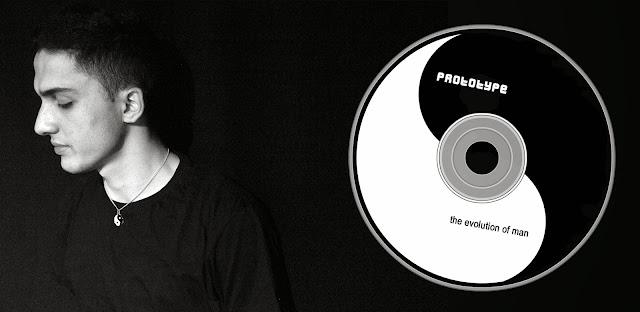
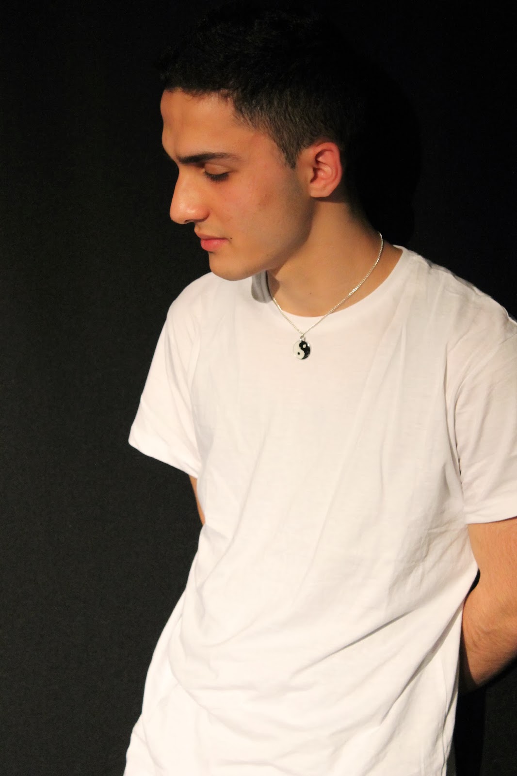
I will be using these two images for my ancillary products. I chose the digipak one as it is a well shot image of the artist and shows the ying-yang necklace. However I may alter the image to monochrome so as to match the black and white theme present in the music video.
 |
| Magazine Advertisement Image |
The second image which I will use for my magazine advertisement was chosen because it is very similar to the Plan B advertisement which I mentioned would be my inspiration in a previous post. I also plan to alter the image to black and white similar to Plan B's image.
[ANCILLARY PLANNING] The Do's and Don'ts
Just like Camel Wrestling, creating a digipak/magazine advertisement has a lot of do's and don'ts but unlike Camel Wrestling I'm pretty sure no one has decided to blog about them, well at least not in such a unique and interesting bullet point formatted style. So strap on your seat-belts, folks, as we go through the universally, socially accepted rules of making a digipak/magazine advertisement.
Do:
- Limit yourself to three colours! Make sure they complement each other and that they are visually appealing (so don't bother trying to use feldgrau, Hitler).
- Just like the colours, limit yourself to two fonts! Make sure their not random, they must relate to the artist or their genre somehow, and for the love of god make sure it's readable. Also don't use comic sans because the internet hates it and it's just best to conform to popular opinions, okay?
- Use a good quality image! Unless your product consists of an image of Sandra Bernhard face there is no reason for it to be pixelated to the point of no recognition. Follow the rule of thirds and make sure the image has some sort of connection to the music video, and you're good to go.
- Give us information! Insert the artist and album name somewhere on there. And Barcodes, copyright information, titles, record company logos, websites won't go amiss, so slap them somewhere on the back.
 |
| Nobody asked for this! |
Don't:
- Under no circumstances should you insert any type of "effect". I don't care if someone's got a gun to your head and they claim to be serious, no one like's to see that crappy neon glow on anything. It looks unprofessional and will always ruin a good image.
- Don't stretch the image! This is self explanatory and is even taught to children at birth in some European countries. So just don't!
- Don't place text in front of the artist's face! It'll ruin perfectly good text.
So by the end of this little ride through the exciting do's and don'ts of making a digipak/magazine advertisement your product should no longer look like this:
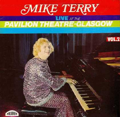 |
| I don't care how much of a Mike Terry fan you are! |
But more like this:
 |
| Wooooooooooh! |
[ANCILLARY PLANNING] Advertisment Inspirations
I looked at various music advertisements for inspiration but one that really caught my eye was Plan B's The Defamation of Strickland Banks. The aspect that attracts me to this advert is the colour scheme as it uses a monochrome palette so as to make the red stand out which I plan to the same with the colour purple instead.
Also the sizing of the images and text is really appealing to me as Plan B takes up about as the text all together, this is done to signify his importance. Also the font is consistent throughout adding to the professional look of this magazine advertisement.
Also the sizing of the images and text is really appealing to me as Plan B takes up about as the text all together, this is done to signify his importance. Also the font is consistent throughout adding to the professional look of this magazine advertisement.
[ANCILLARY PLANNING] Digipak Inspirations
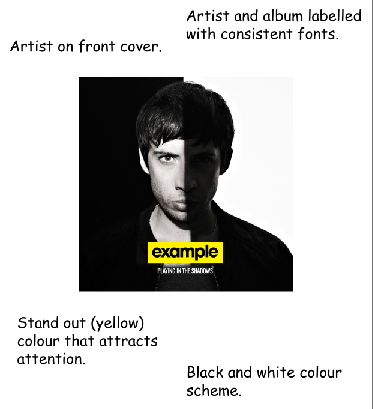
I took a look at Example's (our original artist) Playing In The Shadows album as it provided me with inspiration for my digipak that I am currently working on.
[ANCILLARY PLANNING] Fonts, Colours and Design
After constantly experimenting in Photoshop I finally found the perfect font, colour and design I will use for my ancillary products.
Font: I chose to use the rysky lines font as it gave both an old and new feel which is exactly what prototype is all about.
Colour Scheme: The colour scheme was decided on because of the music video as it also focuses on a black and white colour scheme as it can be seen in the flashbacks and the ying-yang necklace. Also the purple represents the hoody which is purple and consistent throughout the video. This clever use of synergy will allow audiences to identify that the music video, digipak and magazine advertisement.
Design: The rough look created by the dry paint brush helps represent the "edgy" style of the artist and it also helps appeal to the teenagers, who make up a large amount of our demographic.
Friday, 13 December 2013
[ANCILLARY RESEARCH] Analysis of Three Advertisements
I have analysed three advertisements (below in the prezi) to get a clear understanding of how an advertisement should be and how it should appeal to it's target audience. This, I believe will help me in making my own advertisement when I get around to it. (Also, I recommend full screening this as it may be hard to read the text like this).
[ANCILLARY RESEARCH] Analysis of Three Digipaks
I have analysed three digipaks (below in the prezi) to get a clear understanding of how a digpak should be and how it should appeal to it's target audience. This, I believe will help me in making my own digpak when I get around to it. (Also, I recommend full screening this as it may be hard to read the text like this).
[ANCILLARY RESEARCH] Digipak Summary
 A digipak is the packaging of a commercially released audio product. Digipaks allows musicians to represent them and their music. A good digipak can tell customers a lot of information about the musician such as their predominate genre and musical themes. It also helps promote the musician as it can often bring awareness to them; this is even more effective when used with synergy to tie the digipak to a brand, such as using a similar color scheme in the music video and advertisements along with the digipak. A perfect example is Florence + The Machines' album Lungs as seen here.
[ANCILLARY RESEARCH] Last Summer's Digipak
 |
| This is my original digipak (don't judge me) from last year before we left for the summer holidays. |
Before getting to work on my digipak I decided to take a look back at my old digipak and reflect on on it's strength and weaknesses.
Strengths:
- Consistency in text's font and colour.
- Limited the amounts of colours so as not to over-saturate the product.
- Clear indication of who the artist is.
- Use of record company's logo.
- Design complements genre: spray paint represents it's hip-hop nature.
Weaknesses:
- Image of artist directly taken from music video, therefore making the quality of the image rather shoddy.
- Stretched out background image of the brick wall. I'm pretty sure no brick is that long.
- No contact information provided e.g. email, social networks, etc.
- Struggle to read font.
- Logo of artist covers him, implying he is of less importance.
Thursday, 12 December 2013
Mockup Magazine Advert
This is the mock-up to my magazine, which obviously isn't even half done, but to get a quick look of how it may look this is what I've produced. This gives a slight insight into which colours I'm going to use, what photo, and what type of information is going to be provided.
So this photo I liked the most, because it fits well with the size of the advertisement, it's good quality and it's not stretched. I played around on Photoshop with the editing of the photo, but as you can probably see the image stands out, whereas I'd like it to blend in to the black background.
The colours I've used are exactly the same as the Digipak because it has to have some sort of connection whether its the colours, fonts, images for it to have any kind of link. Therefore I've used the same purple as on the Digipak, because I don't want certain shades of colours to be different otherwise it's not going to look very good. I have also used the basic black and white, purely because the Yin Yang necklace which is our synergy link from the music video to the ancillary products is black and white and symbolizes opposites, and so this was the reason for my colour choices.
So far the information that is provided on the advert includes the most important aspect which is the artists name 'Prototype' and the album name 'Evolution of Man'. It also includes reviews from the Sunday times, and NME which are main publishers. I think having reviews is the most important piece of information to have because if your advertising a certain product to an audience they want to know why they should buy it and also what other peoples opinions of it is. I have made a note that I am going to change the second review to a publisher that rewards fives stars just because it looks odd, and the public may not necessarily take into account that certain publishers only reward up to 4 or less stars. Lastly, I have written the release date of the album which is obviously really important, I also have to add so much more, such as:
- social media app logos
- website of the artist and the record label
- photo of the album cover
- & extra.
Ideas for Advert
 I have researched several album adverts, not necessarily from a specific target audience of my own artist, because I only needed some ideas on what to add.
I've gathered that I will include:
- #1 Single / Smash Hit
- Date the Album released, differently typed. For example '10/11/13' or '10th January'
- Artist and Label Website
- Icons of record Labels
- 'Available at iTunes/Play.com'
Another idea that I would like to attempt:
- Advert for 'Exclusive Album' of 100 (Different Picture, colours, additional photos for fans)
Mockup Digipak, Inside Panel
I will be using a different picture and experiment on the colouring of the panels, because you can see the end of the photo mid chest of the artist, makes this so far look really poor.
However I'm happy with the CD and will sick to it's design.
Wednesday, 11 December 2013
Tuesday, 10 December 2013
Reason for the Photo Location
 |
| PROTOTYPE getting ready for his shoot! |
Green Screen room within the college, as it is convenient and pictures can be taken again if the angles are not right or could look better.
RESEARCH: What makes a good album cover ?
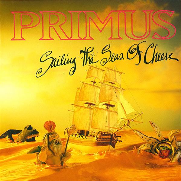 What makes a good album cover ?
(Public Opinion)
Primus - Sailing the Sea of Cheese
"This album cover is freaking awesome. First off, the sea is made of nacho cheese, who can honestly say they don't want to swim in delicious cheese? Next up, dead center, you have a great big beautiful clipper ship with sails full traversing claymation sea monsters and what appears to be Poseidon. All-in-all, giant home run by Primus on this one." -AJ
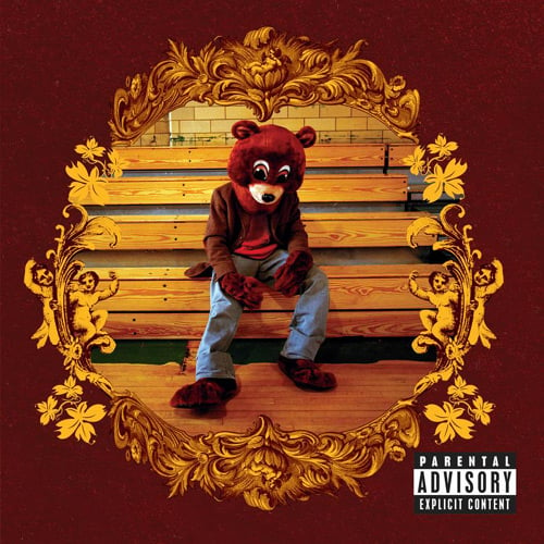
Kanye West - College Dropout
"It's the most ironic album cover that I can think of. A sad mascot, sitting on the bleachers after some homecoming game. Everyone loves teddy bears, Kanye had the hook and we all bit." -Andrea
Stylish animated “band”, grungy yet bouncy, Japanese anime yet Western? Check. Fun yet serious music? Check. Is it all packed into the debut album cover, along with the graffiti logo elegantly placed? Yep.
- Jem Stone
Monday, 9 December 2013
PLANNING: Digipak Draft (Front cover)
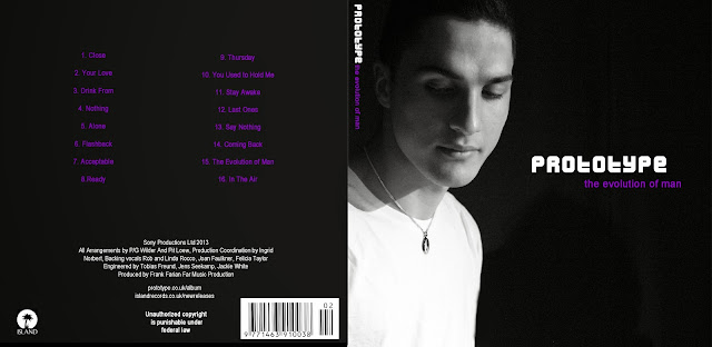
This is the draft 3 panel cover of my Digipak for our artist 'Prototype'
Let's start with the font:
I have chosen the 'Vermin Vibes 2' font for the 'Prototype' Font. I have chosen this font because our artists is modelled from 'example' who is wikipedia defined as a pop-dance/electronic artist. This font has a very futuristic, tech look and can be instantly identified to the dance/electronic genre. However, because this is such a bold and identifiable font, I chose a basic curved font 'Century Gothic' as to not take away from the other font and give it an organised look. I think two big clashing font would look messy especially for a new artist it's not attractive.
As a group, we decided to go with a colour scheme of Black, white and dark purple(to go with the colour scheme of the music video). We also decided (after Dan suggested it) to have the 'ying/yang' symbol as his recognisable thing. It also features in the music video.
Therefore, when we took the photos we made sure to use black t-shirt/white background & vice versa.
I decided not to use a photo for the tracklist background as I felt it would be too much as it is a 3 panel cover it would mean there would be 5 pictures(excluding the cd) of him on the album- a feature that wasn't apparent in my online research and my own Cd's that I own. Usually pictures are in a pull-out booklet which I may feature on the inside
I also added the ying/yang symbol in the album font, replacing the 'O'.
I made a sticker area as I wanted the album to be a 2-disc remix special with extra features to draw in the audience.
I personally like the digipak, I feel it is a good representation of the artist and links in to our music video. I have missed out a few details in the credits that I will add in in the final version.
Digipak Test/Planning
This is one of my few ideas on the way I would like my digipak to turn out.
I think the colours are strong together as it is not too bright and wouldn't be 'in your face' on the stands in the stores. Black and white was chosen because of the yin yang necklace being the main prop and focus in the music video, as a 'symbol' of the broken up relationship and him 'getting better'. I thought it would be important and convenient to have him wearing the necklace on the front cover of the album.
The purple colour was chosen according to costume in the music video, which is the only colour that was brighter and standing out more than any others. Therefore I used purple to make the cover stand out more instead of having it completely black and white or having a colour that is not relevant and made up.
The two fonts I have used (which is the maximum) is Arial Narrow for the track listing, a slight adjustment with Arial for the websites at the back and for the album name in lowercase. As or the artist name I used a more bold font Dilettante all in uppercase and considerably bigger size so it is noticeable. This font I think makes the cover a little more visually appealing/interesting put together with Arial Narrow, Dilettante stands out much more as they are both very different.
However, the tracklisting and 'Unauthorised copyright..' was made bold but still in Arial Narrow, and that's why it may look like there are three different fonts, but I made sure they are still similar.
Subscribe to:
Comments (Atom)


