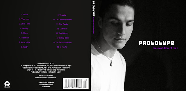
This is one of my few ideas on the way I would like my digipak to turn out.
I think the colours are strong together as it is not too bright and wouldn't be 'in your face' on the stands in the stores. Black and white was chosen because of the yin yang necklace being the main prop and focus in the music video, as a 'symbol' of the broken up relationship and him 'getting better'. I thought it would be important and convenient to have him wearing the necklace on the front cover of the album.
The purple colour was chosen according to costume in the music video, which is the only colour that was brighter and standing out more than any others. Therefore I used purple to make the cover stand out more instead of having it completely black and white or having a colour that is not relevant and made up.
The two fonts I have used (which is the maximum) is Arial Narrow for the track listing, a slight adjustment with Arial for the websites at the back and for the album name in lowercase. As or the artist name I used a more bold font Dilettante all in uppercase and considerably bigger size so it is noticeable. This font I think makes the cover a little more visually appealing/interesting put together with Arial Narrow, Dilettante stands out much more as they are both very different.
However, the tracklisting and 'Unauthorised copyright..' was made bold but still in Arial Narrow, and that's why it may look like there are three different fonts, but I made sure they are still similar.

No comments:
Post a Comment